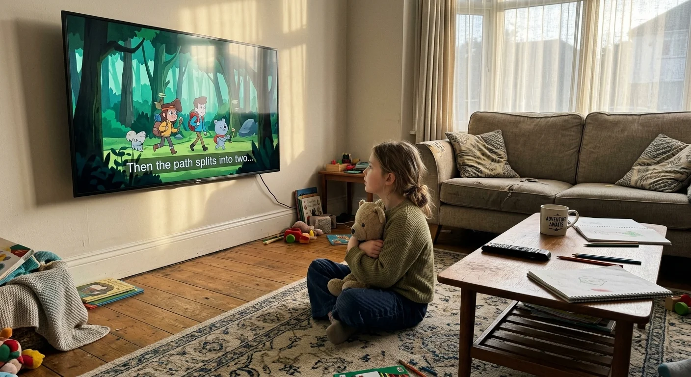
If your child manages an auditory processing disorder, turning on closed captions is essential for bridging the gap between spoken dialogue and comprehension. Yet thick black subtitle boxes often obliterate facial expressions and kinetic visual jokes in animated shows.
Most accessibility guides only judge whether text stands out against bright backdrops. In reality, heavy background bounding boxes disrupt visual storytelling, making granular opacity and drop-shadow controls the true decider of viewing comfort.
We break down how Netflix, Disney+, and Max handle font opacity, edge styling, and character background boxes. You will see exactly which service eliminates background clutter without sacrificing readability.
Visual Occlusion and Auditory Processing: Why Subtitle Rendering Matters
Cord-cutting—canceling traditional cable or satellite TV in favor of streaming services—gives families immense control over what they watch. However, streaming, or watching video content over the internet, introduces wildly inconsistent closed-caption interfaces.
For a child with auditory processing disorder (APD), the brain struggles to interpret auditory signals correctly. Reading captions alongside speech reinforces dialogue comprehension and relieves cognitive fatigue.
Animated series rely heavily on physical visual humor, lip movements, and character eye lines. When an app renders captions inside an opaque black box, it covers crucial animation frames.
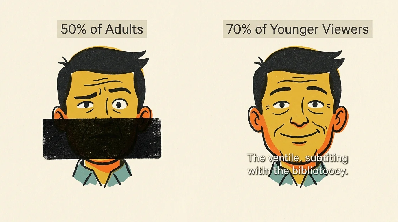
According to a survey by Preply, 50% of Americans watch content with subtitles most of the time. Among younger viewers, that number jumps to 70%.
Federal regulations require basic closed captioning under the Twenty-First Century Communications and Video Accessibility Act (CVAA). The FCC expanded these rules in July 2024 to ensure display settings remain readily discoverable across platforms.
As noted in PCMag’s streaming services guide, platform usability hinges on how smoothly apps deliver essential features like accessibility settings.
When caption settings fail to provide transparency controls, young viewers with APD face a frustrating compromise. They must choose between missing spoken dialogue or missing the animated visual cues that contextualize the story.
Netflix Subtitle Controls: Drop Shadows and Web-to-TV Syncing
Whether you use a smart TV—a television with built-in internet connection and apps—or a dedicated streaming device like a Roku, Netflix delivers strong subtitle tools. A streaming device is a small box or stick that adds streaming capability to any display.
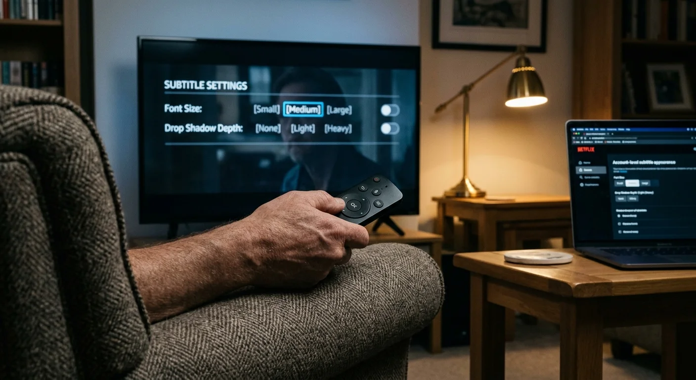
In March 2023, Netflix updated its living room television interface to bring immediate subtitle adjustments directly to the playback bar. You no longer have to exit your video to adjust basic visual styles.
The on-screen menu offers three text sizes: Small, Medium, and Large. It also includes four display styles: Default White, Drop Shadow, Light, and High Contrast.
The Drop Shadow setting is the standout winner for animated content. It renders clean white text outlined by a sharp dark contour without any surrounding bounding box.
This configuration ensures your child reads every word while keeping animated character expressions completely unobscured. The text floats cleanly over both vibrant pastel backgrounds and dark night scenes.
For even deeper customization, Netflix allows account-level styling through a web browser. Here, you can select custom font families, modify background opacity to 0%, and alter text edge beveling.
Once saved, these browser preferences sync across every television connected to that user profile. This eliminates the need to reconfigure caption aesthetics across different household TVs.
Netflix original animated series like The Dragon Prince and Hilda benefit immediately from this setup. The subtitles remain perfectly legible without blocking lower-third artwork.
Disney+ Caption Quirks: The System-Level Setting Hurdle
Disney+ holds the premier catalog for animated children’s shows, from preschool staples like Bluey to feature-length Pixar films. Unfortunately, its closed caption settings streaming architecture frustrates many parents.
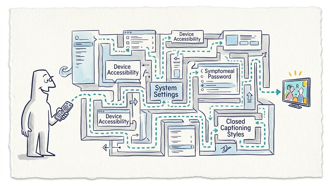
Unlike Netflix, Disney+ often bypasses in-app styling on living room platforms. On Apple TV, Roku, and Fire TV hardware, the app hands caption rendering over to your device’s operating system.
If you want to customize subtitles on Netflix, you tap a button on the remote playback screen. With Disney+, you must exit the app completely and dig into system accessibility menus.
According to Consumer Reports’ streaming media device ratings, system settings menus vary dramatically across streaming hardware. A style that looks perfect on an Apple TV may reset on a Roku.
By default, Disney+ frequently defaults to semi-opaque or fully opaque black rectangular boxes behind white text. In Bluey, these boxes routinely cover bottom-of-screen character gestures and facial reactions.
To fix this, you must manually build a custom profile in your streaming device settings. Set font opacity to 100%, background opacity to 0%, and text edge to drop shadow.
While the browser version of Disney+ offers an in-player styling gear, those tweaks do not synchronize to television apps. This forces you to repeat the calibration process on every television in your house.
Once properly configured at the system level, Disney+ captions look acceptable. However, having to navigate hardware-level menus makes quick adjustments impossible when switching between animated and live-action shows.
Max Customization Options: Balancing Contrast and Visual Interference
Max blends premium prestige drama with extensive animation libraries from Cartoon Network and Studio Ghibli. Its subtitle engine offers an impressive middle ground between flexibility and convenience.
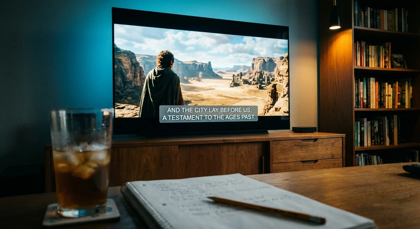
Max includes full caption styling controls right inside its native video player on most connected TV platforms. You can tweak font color, opacity, size, edge effects, background color, and window opacity.
When playing on-demand titles—content you can watch whatever you want, whenever you want—you simply click the gear icon to open the styling dashboard. Adjustments appear instantly on a live preview frame.
To reduce visual distraction, set the background opacity to 0% and select a raised or drop-shadow edge style. This strips away the rectangular backing while preserving sharp character definition against light-colored scenes.
You can also drop font opacity down to 75% on Max. This softens text brightness, preventing captions from drawing your child’s eyes away from the action during high-contrast scenes.
Shows like Adventure Time and Looney Tunes Cartoons feature fast-paced sight gags across the entire frame. Max’s edge-styling controls keep captions readable without covering character footwork or background jokes.
One drawback on Max is profile persistence across multiple hardware models. While settings stick on your primary television, secondary living room streamers occasionally revert to default opaque boxes after app updates.
Checking the settings periodically ensures your child continues to receive a consistent, non-distracting viewing experience. The in-player menu makes checking and adjusting those options fast.
Head-to-Head Comparison: Subtitle Rendering and Accessibility Specs
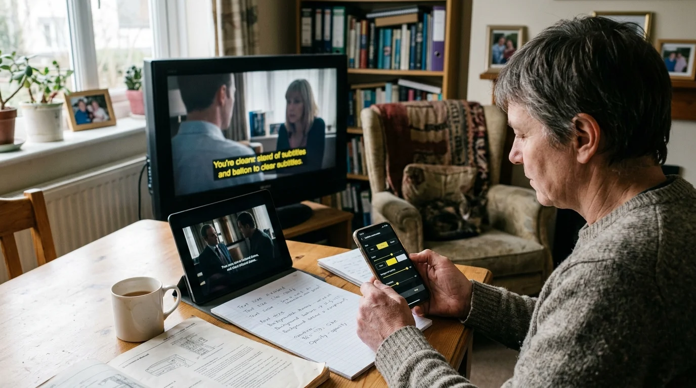
To evaluate how these platforms handle closed-caption styling, we compared their visual customization parameters. The focus is specifically on reducing visual occlusion during animated content.
| Accessibility Feature | Netflix | Disney+ | Max |
|---|---|---|---|
| In-Player TV Adjustments | Yes (3 sizes, 4 styles) | No (Web browser only) | Yes (Full styling menu) |
| Text Opacity Range | 100% or Semi-Transparent | Device OS dependent | 25%, 50%, 75%, 100% |
| Background Box Opacity | 0%, 25%, 50%, 75%, 100% | Device OS dependent | 0%, 25%, 50%, 75%, 100% |
| Character Edge Styling | None, Raised, Depressed, Uniform, Drop Shadow | Device OS dependent | None, Raised, Depressed, Uniform, Drop Shadow |
| Live TV Setup Preview | Yes (Immediate rendering) | No (System menu exit) | Yes (In-player window) |
| Hardware OS Bypass | Yes (Uses proprietary renderer) | No (Defers to host OS) | Yes (Uses proprietary renderer) |
| Profile Cloud Syncing | Yes (Syncs from browser to TV) | No (Device-specific) | Partial (May reset after updates) |
“The best streaming accessibility features provide effortless clarity without screen clutter, letting a child focus on the story rather than reading around heavy black boxes.”
As the table demonstrates, Netflix and Max give viewers direct, proprietary rendering engines. Disney+ relies on whatever operating system runs your streaming device.
This difference is critical for households with multiple streaming devices. Customizing subtitles across Netflix and Disney requires very different workflows depending on your hardware ecosystem.
Worked Example: Calibrating Subtitles for a 22-Minute Animated Episode
Consider a practical calibration scenario carried out on September 14, 2024, on a standard 55-inch 4K television. The television has a screen area of 1,293 square inches and a native resolution of 3840 by 2160 pixels.
In this scenario, a child with auditory processing disorder watches a 22-minute episode of an animated series containing 320 dialogue lines. Each line stays on screen for an average of 3.2 seconds.
Captions remain active for a total of 1,024 seconds, representing 77.5% of the episode’s entire runtime. Under default settings, the app renders a solid black box measuring 600 pixels wide by 140 pixels high.
That default black box covers 84,000 pixels, or approximately 28 square inches of visual real estate. For over 17 minutes of the episode, that opaque rectangle conceals the bottom third of the animation.
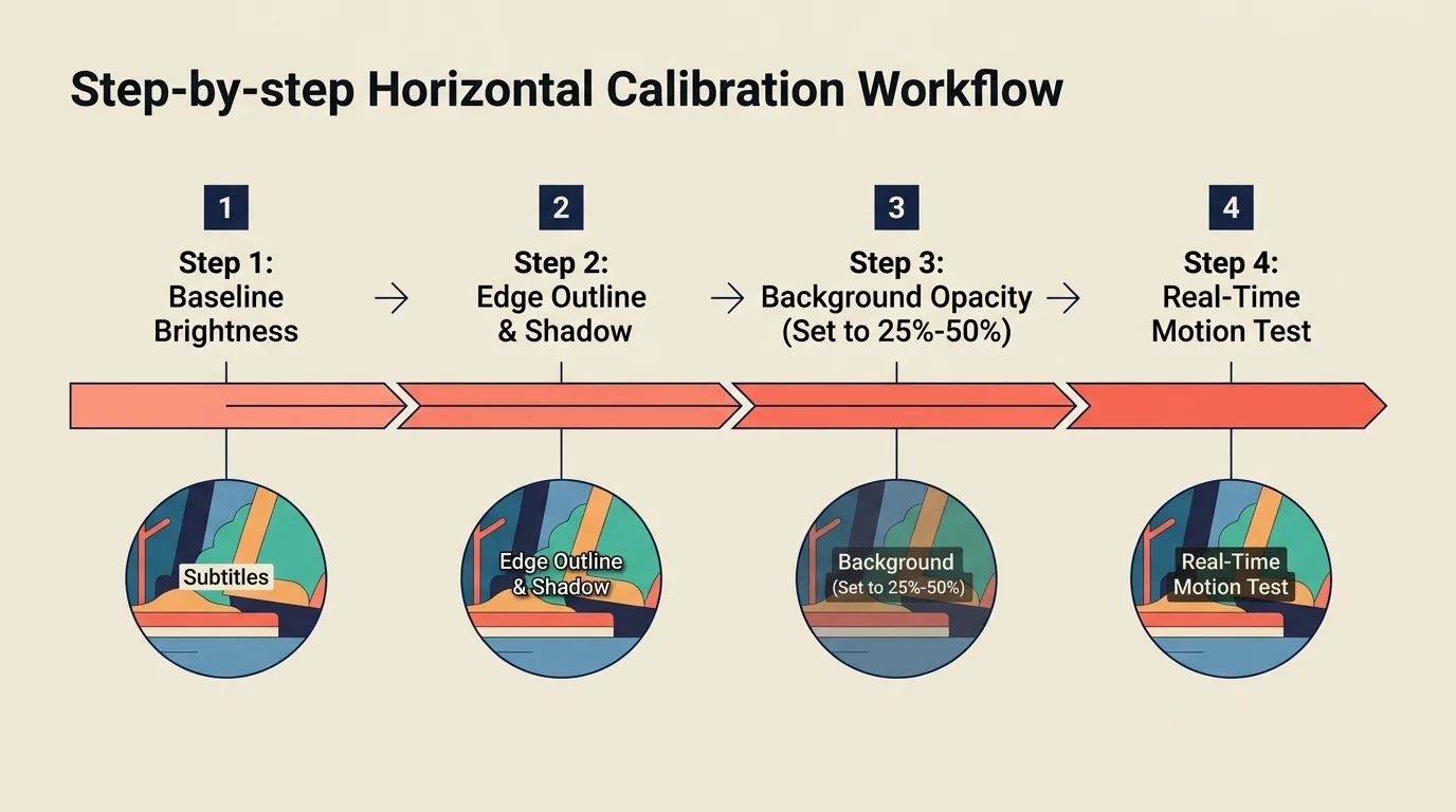
To eliminate this visual interference, we calibrated the subtitle parameters using three specific adjustments:
- Set background opacity to 0% to completely eliminate the black rectangular box.
- Enable a 2-pixel black drop shadow edge with font opacity set to 100% white.
- Select the Small font size (roughly 75% of default height) to match the child’s reading field.
With these settings applied, the occluded screen area dropped from 84,000 pixels down to 18,200 pixels of pure letter glyphs. This represents a 78.3% reduction in blocked screen space.
Character mouth movements, foreground items, and secondary visual gags became fully visible. The drop-shadow outline provided sufficient contrast against bright pastel backgrounds without fatiguing the viewer’s eyes.
Plans, Pricing, and Stream Limits: Value for Accessibility-Focused Families
Ad-supported plans offer cheaper monthly rates with commercials, while ad-free subscriptions cost more but remove commercial interruptions. Most streaming apps do not include a DVR—digital video recorder—because on-demand catalogs remove the need.
However, ad-supported playback can disrupt caption stability. During commercial transitions, ad-insertion software can occasionally cause customized subtitle settings to reset back to default black boxes.
According to Wirecutter’s streaming video review, choosing between ad tiers and premium plans often comes down to viewing habits and screen limits.
Here is how current pricing and simultaneous streaming limits compare across the major platforms:
| Streaming Service | Monthly Price | Annual Cost | Simultaneous Streams | Free Trial Length |
|---|---|---|---|---|
| Netflix Standard with Ads | $6.99 | N/A | 2 | None |
| Netflix Standard (Ad-Free) | $15.49 | N/A | 2 | None |
| Netflix Premium (4K + Ad-Free) | $22.99 | N/A | 4 | None |
| Disney+ Basic (With Ads) | $9.99 | N/A | 4 | None |
| Disney+ Premium (No Ads) | $15.99 | $159.99 | 4 | None |
| Max Basic with Ads | $9.99 | $99.99 | 2 | None |
| Max Standard (Ad-Free) | $16.99 | $169.99 | 2 | None |
| Max Ultimate 4K | $20.99 | $209.99 | 4 | None |
None of these three services offer a traditional free trial. You must subscribe for at least one month to test their accessibility features in your home.
If you have multiple children streaming in different rooms, Disney+ offers the best stream allowances on its base plans. You get four simultaneous streams even on its entry tier.
Netflix limits you to two streams unless you pay for the $22.99 Premium plan. However, Netflix’s account-wide profile syncing means you only set up accessibility preferences once.

Platform Verdicts: Which Service Works Best for Your Household?
Selecting the best service depends on your tolerance for menu setup versus your child’s content preferences. Here is our direct evaluation of each platform.
Is Netflix worth it for accessibility? Yes. Netflix offers the most reliable living room experience with four instant contrast presets and cloud-synced profile preferences.
Is Disney+ worth it for accessibility? Yes, but only if you take time to calibrate your streaming device at the operating-system level. The content is unbeatable for kids, but the app itself lacks native in-player controls.
Is Max worth it for accessibility? Yes. Max provides the deepest in-player adjustments, letting you dial in background transparency, font size, and text opacity with live visual feedback.
- Best Overall for Low Visual Occlusion: Netflix (Drop Shadow preset eliminates background clutter in two clicks).
- Best for Detailed Text Fine-Tuning: Max (Extensive font opacity, edge styling, and color sliders inside the player).
- Best Content Library with Extra Setup Required: Disney+ (Requires hardware-level accessibility configuration on Roku and Apple TV).
For children who rely on subtitles to manage auditory processing challenges, avoiding massive black bounding boxes is essential. Taking ten minutes to configure drop-shadow styling transforms captioning from an obstructive chore into a seamless learning aid.
Frequently Asked Questions
How do I customize subtitles on Netflix for a child with sensory or auditory needs?
Open any video on your television and press down on your remote to access the playback bar. Select the audio and subtitles icon, choose your subtitle language, and pick the Drop Shadow style to remove dark bounding boxes.
Why do my Disney+ subtitle settings keep reverting to an opaque black box?
Disney+ defers to your streaming hardware’s system settings rather than saving custom profiles inside its living room app. You must enter your Roku, Apple TV, or Fire TV accessibility menu to build and save a permanent transparent preset.
Do ad-supported streaming tiers affect closed-caption display quality?
Yes, ad-supported tiers can occasionally cause caption formatting glitches. Commercial insertions sometimes force the video player to reload, resetting customized font opacities back to factory defaults.
What is the best subtitle contrast setting for animated TV shows?
The optimal setup is 100% white text, 0% background opacity, and a sharp drop shadow or uniform edge outline. This preserves character animations while ensuring crisp legibility over both dark and bright backgrounds.
Disclaimer: Streaming service prices, content libraries, and features change frequently. Prices shown were accurate at time of writing but may have changed. Always verify current pricing on the official service website before subscribing.